Work Collection
New York Public Library Career Center
The Library Career Portal intends to bridge the growing gap between the library and the community.
Client
New York Public Library is a non-profit library system operating within NYC
My Role
I was a remote UX Researcher and Designer working on a team of 3 UX Designers. I conducted concentrated research, led ideation workshops, and finally was part of the design process for mid-fi wireframes and prototyping.
Overview
The Challenge
Access to education unlocks many avenues to personal, economic, and mental growth. Being able to ask the right questions and discern trustworthy information is essential to exploring the world we live in. So, why are we keeping access to some of this information behind the paywall of a college degree? Libraries; cultural institutions that have housed our collective knowledge base for centuries, have consistently served the public access to reputable, reliable sources of information. With the advancements in smartphone technology and the growth of the digital world, the public library system is slowly losing its connection to the young adult population. As a public resource, libraries must also keep up with the advancing world in order to maintain a relationship with the community, keep patrons coming back, and prevent the ever-growing paywall from deterring all access to knowledge.
Project Goal: Help a library bring awareness to the resources it offers to the digital generation and showcase the value that libraries serve in the community.
Process Flow

As experience designers, we would love a process to flow as intended. Unfortunately, real work does not move this smoothly and as new use cases pop up, new limitations are introduced, and new results appear in testing, this guide helps us navigate toward the end product without being a rigid tool limiting our ability to keep the end-user the main focus.
In my work, I have found value in using this model to explain the value of UX to teams that may not understand its role, as it provides a visual into the work of a designer as well as the intended deliverables from each phase.
Research
Competitor Digital Learning Tools

To make sense of the project, we began with some general questions and sought out experts, users, and competitors to find our answers:
What does the public library system offer right now?
What are other library-esque resources that exist currently? Are we filling a niche or crowding the industry?
What are current impressions young adults have of the library?
Why is there a disconnect between these populations?
Interviews
The team conducted interviews with SMEs in the library system, launched a broad scope of exploratory research, as well as a competitive analysis. Managers, librarians, and library partners all appreciated the approachable nature of a library. The internet will always be ahead of print media in terms of most up-to-date details on topics, and this project did not aim to find ways a library system is “better than” the internet. We were able to walk away from these interview understanding that libraries provide the community with a trustworthy, safe, and free place to begin the journey to learning anything. Many libraries even provide remote access to their e-books (fiction and non-fiction) with just a library card! The library is a place to learn, whether it's learning to read, learning to code, or learning to imagine great expansive universes outside our reality. We decided to hone in on this aspect; the library is a place of knowledge, of education.
Define
After collecting this information, we created a cohesive problem statement and focused our direction:

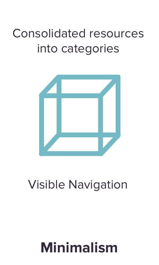
To set the vibe and direction for the platform, we defined some design principles:

We condensed even further to create user personas; model versions of our users. For example, Lindsey represented a portion of the population we were designing for and served as a reminder of the inclinations of our user base and their experiences supported by what we found from our interviews


After understanding the project space, we turned our attention to the target users of the platform; the young professionals. We met with young adults and asked them about their experiences with the public library system and online learning tools. By condensing all of this data into an affinity map, we saw emerging trends, which gave us focus into the user’s experiences.
We then modeled Lindsey’s experiences with online learning platforms as a working millennial. Using the insights gathered from exploratory user interviews, we mapped the actions Lindsey may take and corresponding emotional states. This helped us identify points where the library can step in and alleviate some of those frustrations

Ideate
After laying out Lindsey’s current journey, we also needed to map out how our product would improve her life. We created user flows of our product. This helped us understand how many steps someone like Lindsey would take to complete a task, as well as show us which screens would need to be designed.


Following the creation of these users flows, we had a few sketching workshops within the UX Team and by including some SMEs so that ideas from various levels of expertise could be brought together.
Build, Test, Repeat
These user flows served as a great base for our sketching and wireframing. We designed a few universal components and slowly began refining new elements for our UI kit. We identified what features users such as Lindsey would benefit from and created sketches of our screens. Using Figma and Invision, we tested these sketches and low-fi wireframes before creating a workable, testable prototype which would serve as a guide upon handoff.
For our final usability tests, we conducted moderated tests using our mid-fi prototype. The goal was to assess our design decisions on functionality.
Below is the evolution of the landing screen for the “Courses” section of the platform from low-fi sketches to a mid-fi prototype and eventually a hi-fi screen design:


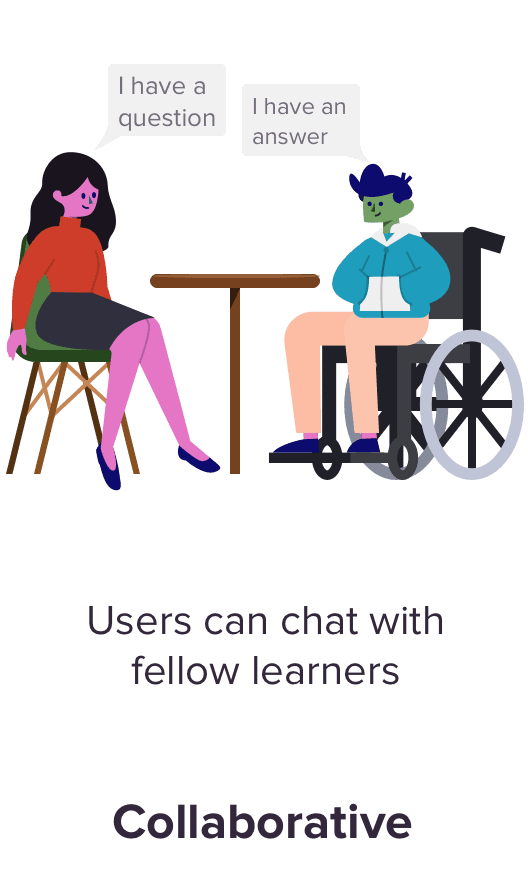
User testing allows us to collect both general and targeted feedback about the Career Center. Solutions the UX Team saw as beneficial to the end-user but have had some push back from other teams, now had evidence for us to better advocate for those end-users. The main features we wanted feedback on surrounded the course chat and the structure of the course (pre-recorded vs live videos). This would be the biggest lift developmentally and had received some pushback. We want to build a case for the value of a course chat so that it could be added as a backlog item for development. Here is a snapshot of the feedback we received


Retrospective
This was a project that hit home for me. Being a recent college grad looking to improve on skills and enter the job field, I was also a potential user for this platform! This put me in the unique position to learn how to cut my personal bias out of the research. I learned to be conscious of what my input was communicating. I also learned to really value the discovery portion of UX research. The goal is to gather as much as possible and find connections between all the data. New information constantly arises and the process never really ends but that is the beauty of the UX process; the learning never ends!