Work Collection
Member Portal - Navigation Research
In order to remain competitive and keep up with portal usage metrics and demands of the member base, Independence Blue Cross initiated the Digital Front Door (DFD) Project. This is a cross-team project which aimed to revamp the member portal experience, introduce new care-focused features, and improve members’ perceptions of the company.
Client
Independence Blue Cross is the primary health insurance provider, servicing the Greater Philadelphia Area
My Role
I am a hybrid UX Researcher and Designer working on a team of 4 UX Designers as well as 2 UX Researchers. We conducted both broad and specific research, ideated, and finally designed mid-fi wireframes and prototyped the product
Overview
The Challenge
Health insurance is an incredibly complicated system for anyone to navigate. Coming from a public health background, I’ve seen how low on the priority list health insurance lives for the average American citizen. Additionally, many of these companies choose to intentionally make the process of utilizing the insurance service very analog and difficult to navigate. Knowing the prejudices that the customer-base (members) may hold, combined with the business initiative to be a digital-first, technology-forward company, we were tasked with overhauling our member-facing platform; the Member Portal. At the same time, the Technology team was gearing up for a multi-year migration to in-house data management systems and platforms.
Project Goal: Create a member experience that solves current member pain-points and provides quantifiable value as a digital tool in a member’s health journey.
Research
Foundational Work
Having joined the project once a timeline was decided, my role as an experience researcher was to drive the discovery of all the capabilities outlined for this new digital first door (DFD) experience. Initially, we determined a minimal viable product (MVP) of the platform - which capabilities are essential before go-live, and further sized and prioritized the features.
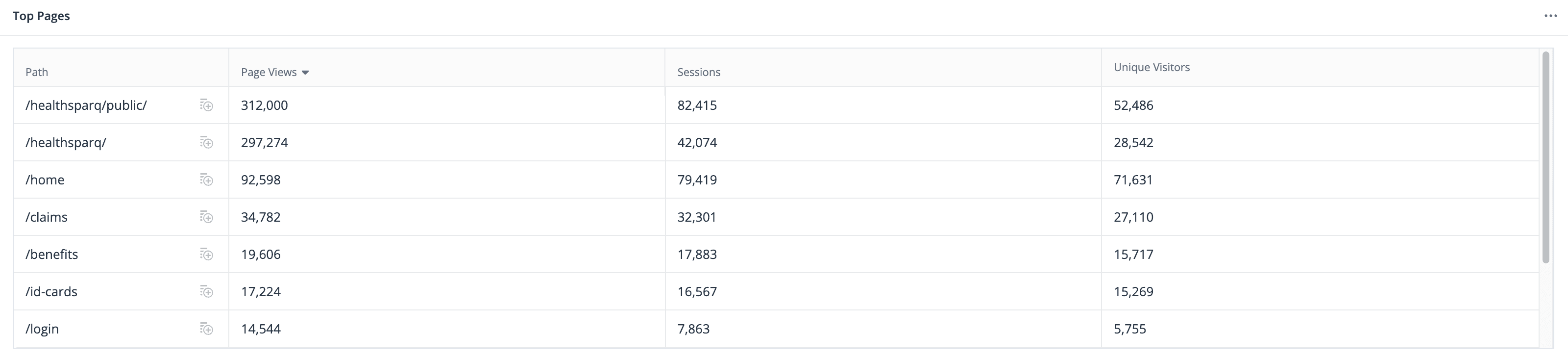
One of the measurement tools Independence Blue Cross implements is QuantumMetrics. With this tool, we are able to collect data points on usage, technical issues, and map out user flows of the current portal experience. Our main goal of Phase 1 was to gather a baseline of how current members are interacting with the platform, map their user flows, and identify what the main frustration points are from an experience and technology perspective. I documented these insights within Mural as to share these takeaways enterprise-wide.

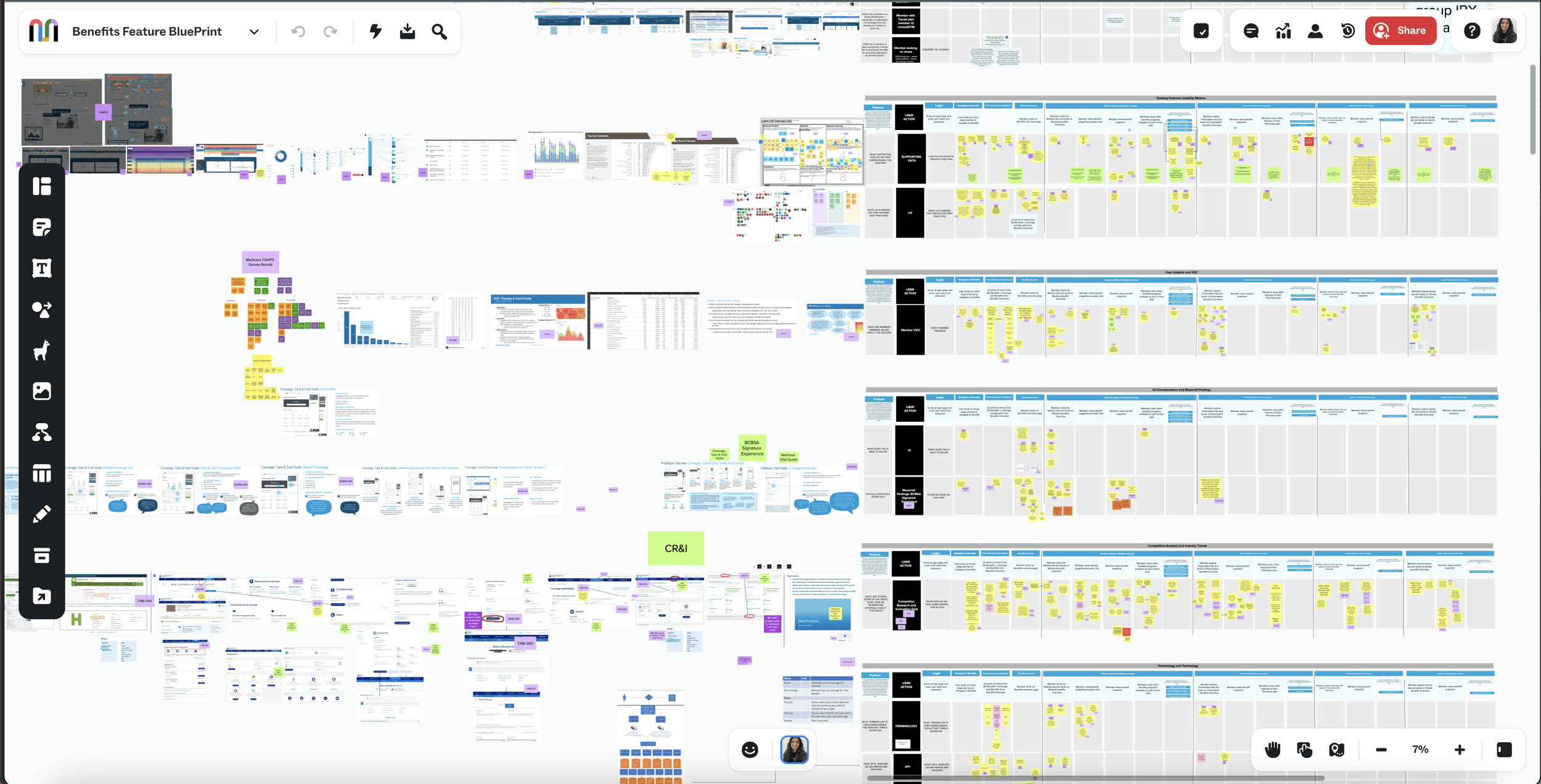
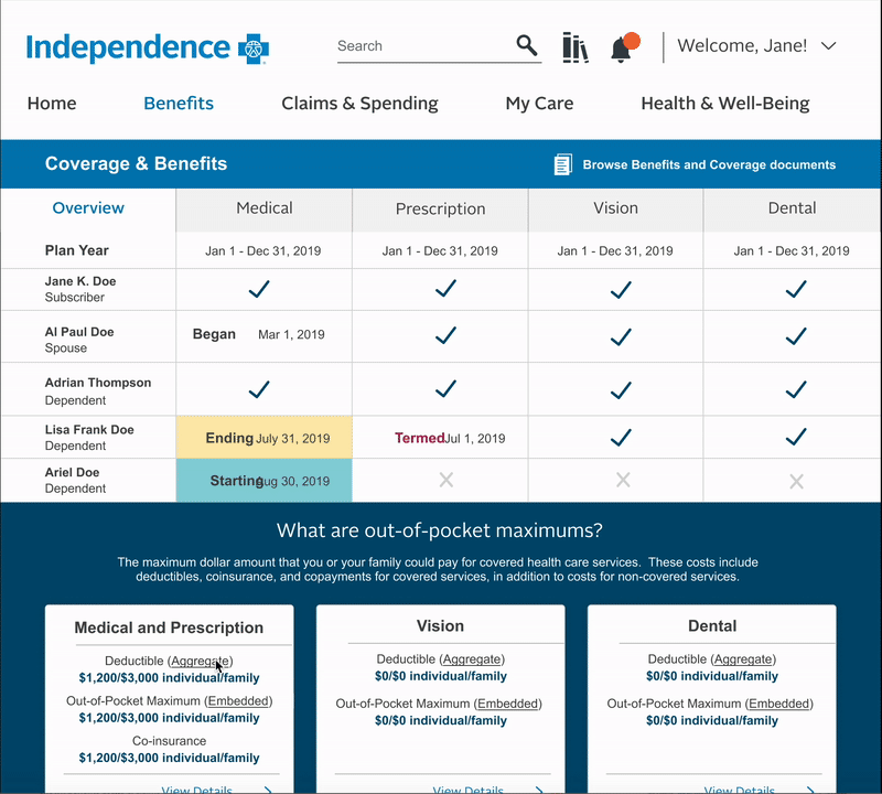
Within this Mural, we also explored competitors and general practices for desktop interactions. The main display format of the current portal contained a “flyout” panel moving in from the right of the screen. This housed any details pertaining to the content on the screen. I noted that this interaction format was outdated, and launched a review of all navigational elements of the portal.
Note: The business stakeholders had already decided on and provided buy-in to the project if the navigation was implemented as a side menu as it is a visual departure from the previous top menu. While we argued for further testing to confirm this request, we ultimately needed to comply with the business ask.
Define and Test
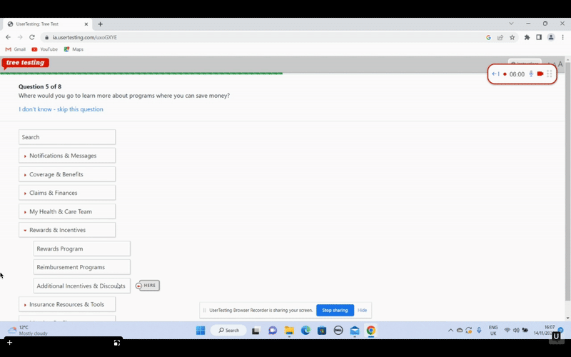
We collected the usage metrics of navigation to identify the top features members are utilizing, and then conducted a tree test of the current navigation. We were looking to find answers to the following questions:
Do members understand the current groupings?
Is the location of the global navigation intuitive?
Which pages should link to one another?
My team now had an initial round of capability groupings based on the current pages however, in alignment with business practices, I wanted to get the perspective of the SMEs providing content to these capabilities. The next question I hoped to answer was “As the respective stakeholders continue to add content and enhancements to these pages, will the navigation satisfy their needs?” The team and I conducted an open card sort with the appropriate stakeholders. From here, we identified which capabilities the SMEs find deserve their own pages and which items can be grouped. The result of this open card sort provided me with a base for a closed card sort with users. Items that are important to business stakeholders may not be priority for members but this card sort had the added goal or creating a priority list for both stakeholders and users.
Having now identified the priority items for users, I conducted the final closed card sort for the actions a user can take within these features. This helped inform the capabilities that the team and I recommended to business systems analysts and developers; further sizing the effort needed for these features.
Now we were aware of which features should be easily accessed by the user, which features stakeholders want to drive traffic to, and which groupings made sense for the user. To ensure we recommend a design that is evidence-based, we conducted a tree test to confirm the proposed solution. This informed the recommendations for creating a site map for both desktop and native app as well as which items should be available on the dashboard.
Cross Team Review
The team and I then spoke to development team and presented our insights and final site maps. From this conversation, we were informed of an additional hurdle; long call times and system load. Developers then informed us that the proposed items displayed on the dashboard will require calls to multiple databases until the migration to NextGen is complete. Due to this limitation, I then spoke to the developers of each potential concept on the portal and confirmed the load times to display what we have defined as the minimal amount of information for each feature on the dashboard.

Back to the User
Unfortunately, I determined that the load times for the dashboard page content would be over 3 seconds. This leads to about a 40% drop-off rate. Additionally, if a service call were to fail, the user would have nothing to interact with for that capability and be dead-ended unless they were to navigate using the side navigation. This leads to an overall poor experience as the user is presented with a “broken” landing page.
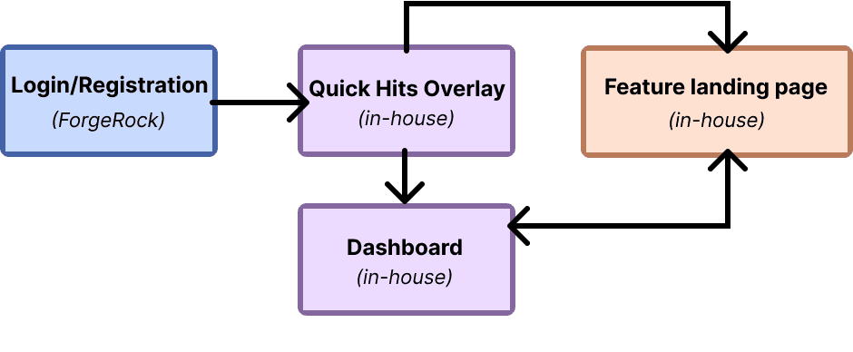
Through back and forth conversations with development and product owners, the team and I concluded that a “quick hits” page utilizing the prioritized capabilities from earlier research would prove to be a short-term solution. The user would be presented with a selection screen before landing on the dashboard which can take them to deep-linked content with the option to “skip to dashboard”.
Regarding the functionality, this “quick-hits” page populates as an overlay on the dashboard, allowing the dashboard a few more seconds of load time or gives the user the option to go directly to a capability. I confirmed with development that once the user is within the platform, the service calls for the dashboard would run in the background solving the pain-point of a long loading landing page.
The last piece of research I wanted to conduct before handing off the feature to the design team was an assessment of the layout and flows we intended to present to the user. I conducted an A/B test of the proposed flows using a mock up of a Dashboard with a long loader animation, and one with a mock up of a “quick hits” page. The results indicated that while users were satisfied with the option to select an item on a “quick hits” page, those who skipped straight to the dashboard found the additional page to be cumbersome. I also saw users state that the longer load times are less desirable than an additional page. This confirmed to me that the “quick-hits” page, while an extra step, would be a viable short-term solution until the migration to NextGen is complete


Handoff
Final Recommendations and Next Steps
These sprints ended with our final recommendations for a desktop site map, desktop dashboard content, and a low fidelity mock up of the “Quick Hits” and Dashboard pages. In an attempt to learn more rounded design skills, I took the additional step to work with the A11y SME and annotate the designs.
Next Steps
Continue the research process for all features within the portal roadmap
Work with the content writer and SMEs to develop content for the portal
Begin research process for mobile-first native app development
Retrospective
This was my first introduction to a UX Research process at a large-sized company. I am accustomed to being the researcher AND designer however I learned so many valuable research skills working on the Member Experience team. From quantitative tools such as QuantumMetrics, setting up a voice of the customer (VOC) program (Medallia), and conducting wide spread consumer research, my love for advocating for the user has expanded. Socially, users are arriving to the product with a negative perspective, it is my role to make the strongest case possible for the user and contribute positively to the journey of utilizing a service that already has many road-bumps. I also learned how to better blend my expertise as a designer with the needs/demands of a business.