Work Collection
Member Portal - Mental and Behavioral Health Hub
Independence Blue Cross has taken steps to expand coverage and benefits for mental and behavioral health needs. In response to the general decline in mental health due to COVID-19, the rise in medical costs, and the normalization of seeking out mental health care, IBX launched various initiatives to show their commitment to the mental and behavioral health care of its members.
Client
Independence Blue Cross is the primary health insurance provider, servicing the Greater Philadelphia Area
My Role
I am the lead UX Researcher working on a team of 3 UX Designers as well as 2 UX Researchers. I facilitated conducting broad and specific research, defining a project roadmap, ideated on solutions, and worked across teams to ensure the project continues to develop as intended.
Overview
The Challenge
Within the member portal, we have a section dedicated to deep dives into various health conditions called Health Journeys. Health Journeys is a larger effort by IBX to provide members guidance throughout any health event/condition that they may be navigating. This area of the portal serves to house benefits information, provider information, and any education materials specific to the health event/condition. Additionally, there is an internal initiative to prioritize mental and behavioral health for members. This means expanding provider networks, advocating for member coverage needs, and providing support options for members at any stage of their care. Within the portal, we have a Mental and Behavioral Health-Health Journeys page. This page has a lot of opportunity for enhancements to truly provide value in members self serving their mental health as well as drive members to all the various solutions we offer and maximize usage of their benefits.
Project Goal: Enhance the Mental and Behavioral Health - Health Journeys pages to drive engagement and solve to common pain-points identified within member feedback.
Research
Foundational Work
As lead on this project, I took on the role of defining a strong base for all the collaborators on the project. This was going to be a multi-department, phased effort to ensure we meet the expectations of the relevant stakeholders but prioritize designing an experience that best serves members. To establish this base, we began with user surveys, interviews, as well as reviewing usage metrics and member voice of the customer (VOC) verbatims.


I created this template to streamline the test creation process for those on my team who are not familiar with the process to cross-train
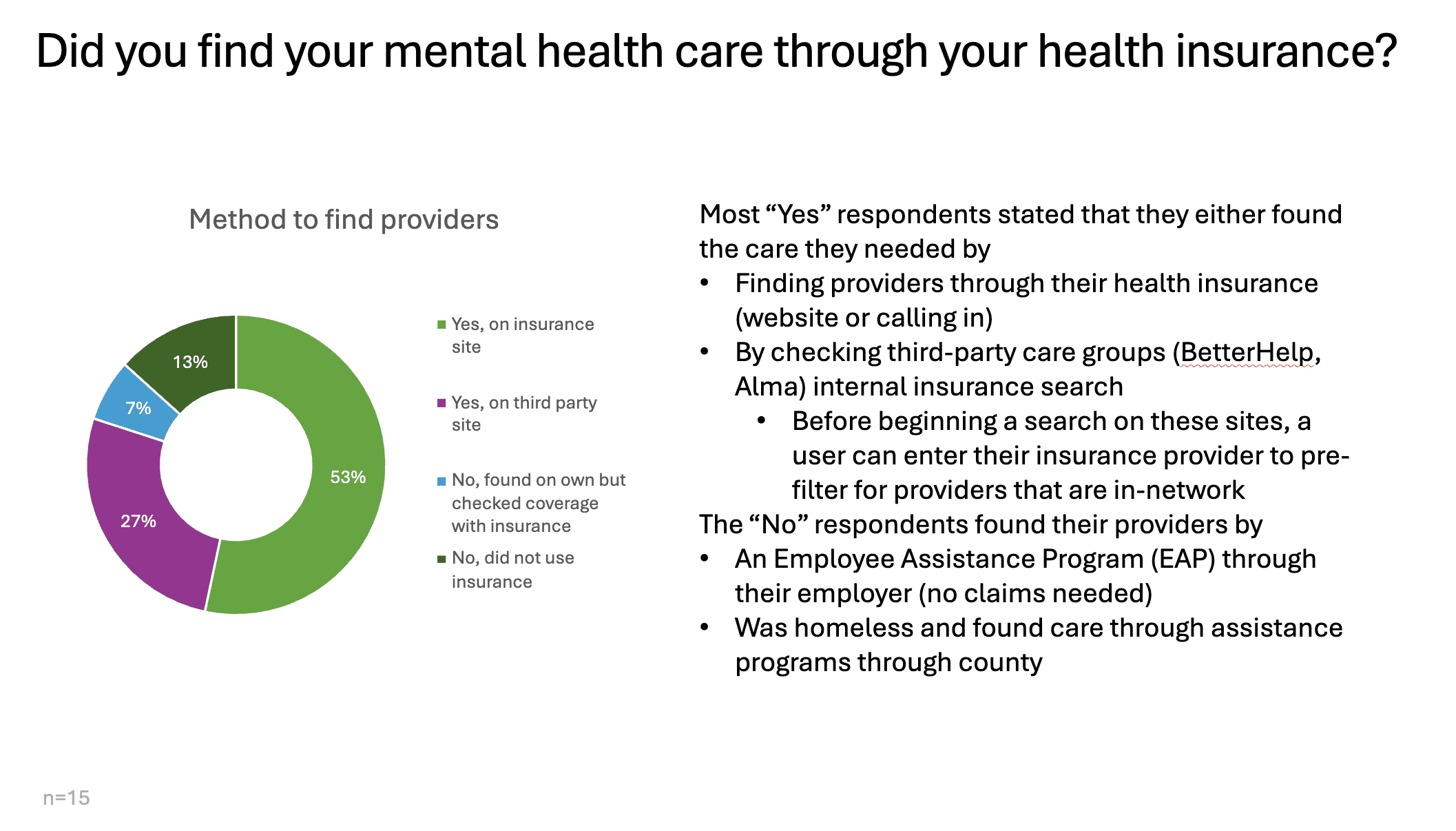
I first designed a user survey with the intention of gathering user perceptions, behavior metrics, and determining whether user leaned more negatively or positively when seeking out mental health care. As I was developing this survey, it was clear that we needed distinct data between those who have already sought out mental health care and those who have not. I then added a screener question to take the participants down different tests based on their experience.
Below are some of the insights gathered with this survey and user interviews:

After meeting with users, I also conducted interviews with the relevant SMEs within the company. The intention here was to get an intended timeline and rough prioritization of goals from their end. Additionally, because the member portal would be displaying clinical content, we also wanted to make sure that any changes are properly vetted and approved according to their established process.
Main Takeaways:
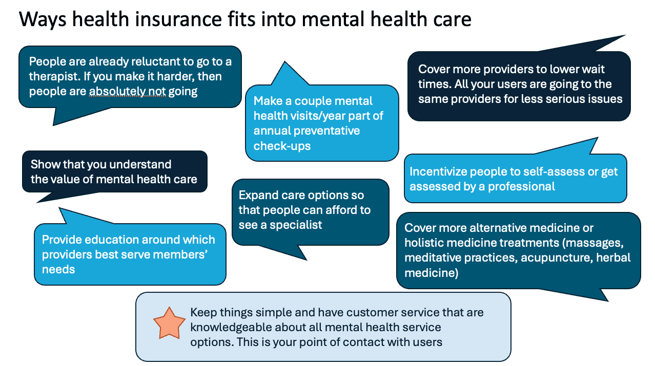
IBX has worked to expand their provider network and partnered with many mental health provider groups. The provider data of these practitioners is housed separately due to technical limitations.
IBX has also hired dedicated customer service reps who can provide more of a clinical assessment over the phone and guide members to the kind of specialist they need.
IBX has established metrics to ensure that the providers and provider groups meet the standard for high quality care.
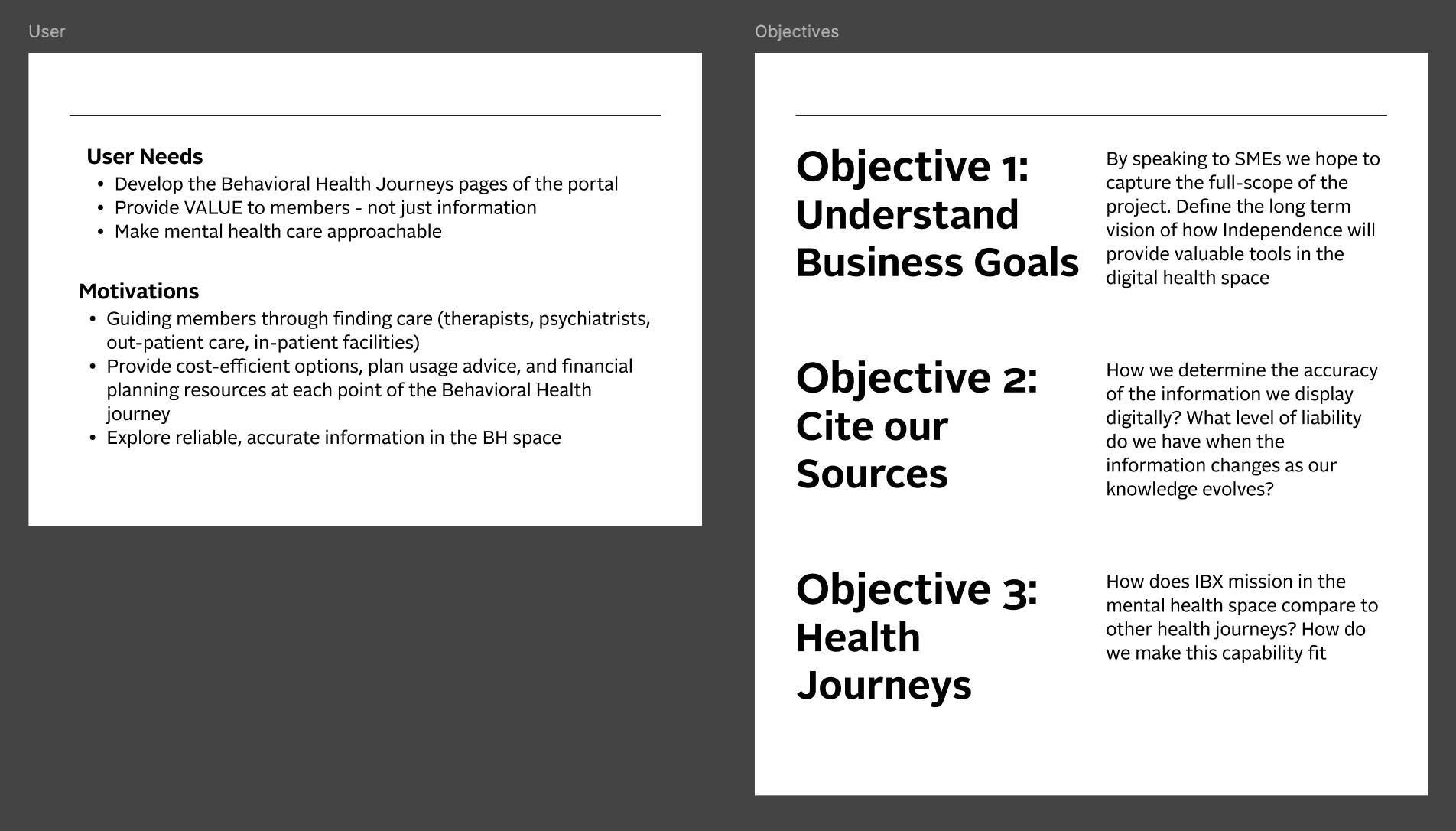
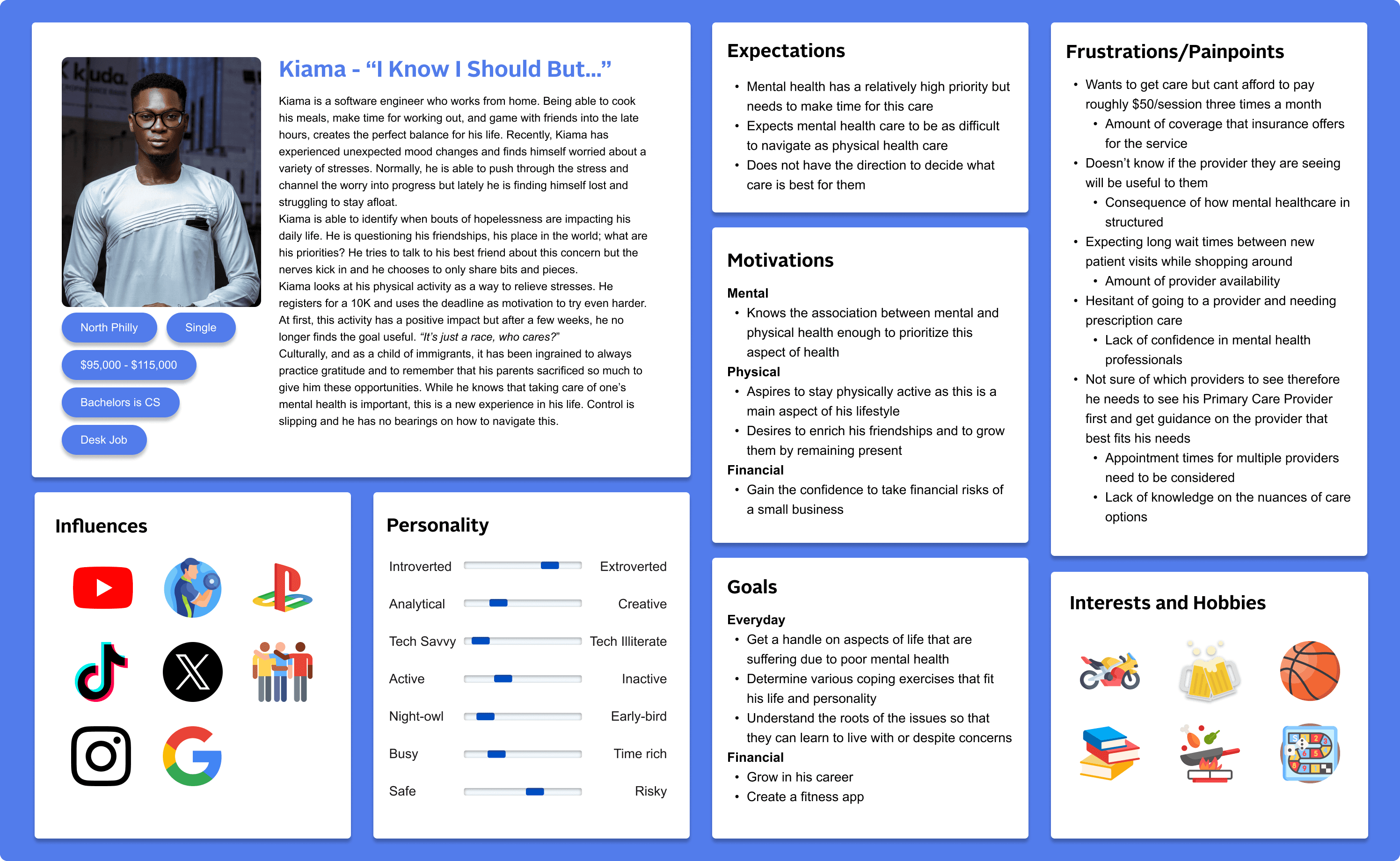
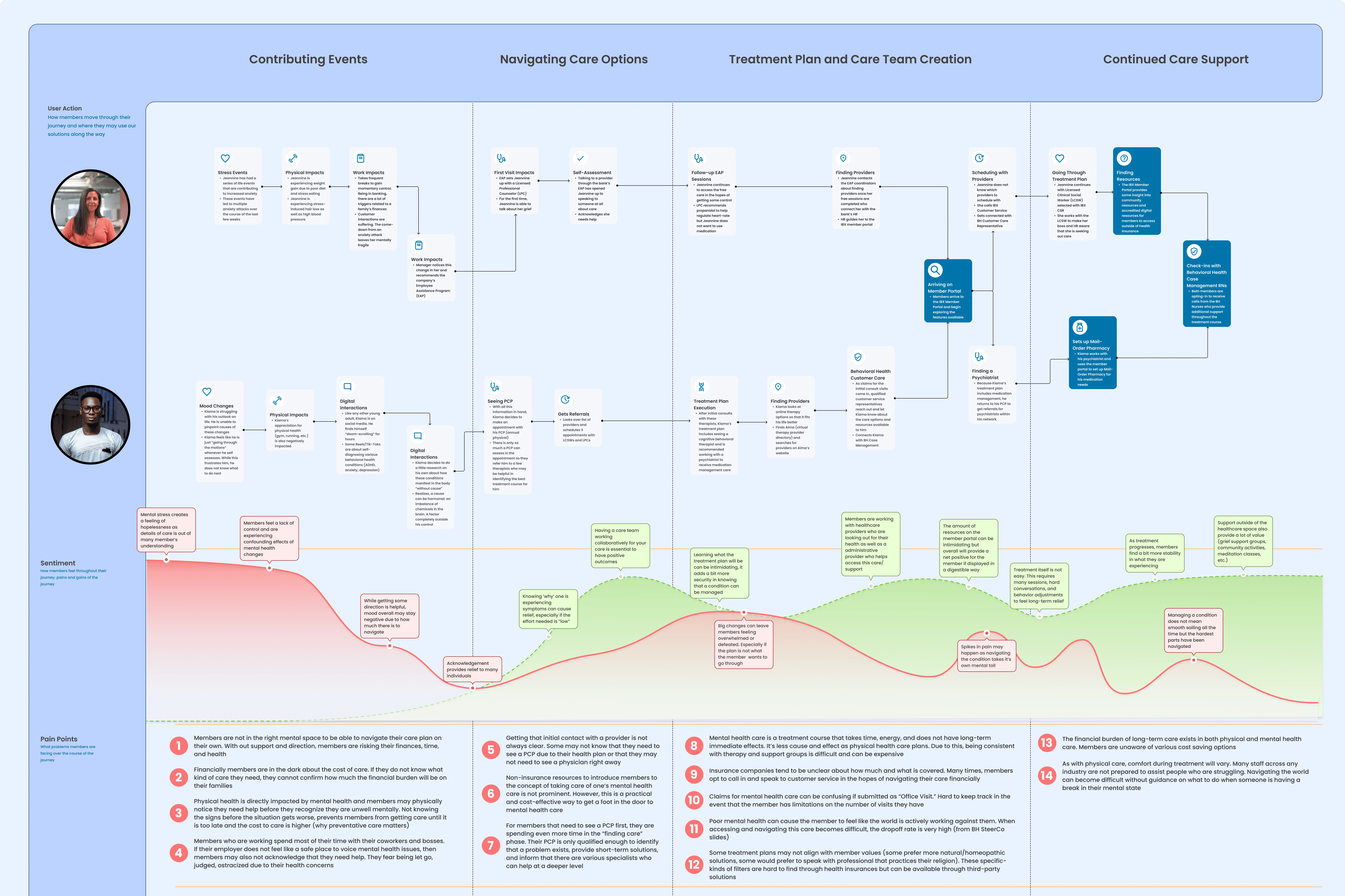
Defining the User
In order to properly establish a foundation that can be shared out to the relevant collaborators, I defined some guiding principles. I then compiled all the quantitative and qualitative data that had been gathered so far into a few user personas, and a member journey. The intention was to have these users displayed during each touchpoint and continue to maintain that empathy when we are discussing feasibility.


In the conversations with SMEs and stakeholders, I learned how strongly UX folks need to advocate for user needs. There were countless moments where I needed to bring the conversation back to the feedback we are receiving from our members and remind the group that while an investment of resources is necessary, our goal is not to "get a product out" but to create a product that provides support for members. I learned how to stand my ground professionally and ensure the user's voice is heard.
Content Review
Now that we had defined an objective base and gathered member feedback on the current experience, I conducted a heuristic evaluation of the content and layout of the pages in this experience. I looked for how efficient the use of space on the page was, whether the language is familiar and approachable to the member, etc. I also conducted a usability test of the current platform to determine quantitatively members' understanding and general navigatability of these pages.
Main Takeaways:
Navigation
74% of users were not able to easily find this section of the portal but once they arrived, most users noted that an area dedicated to conditions is a nice to have
44% of users expressed frustration due to single-page navigation of this area. Clicking a button and being scrolled down the page to a lower section was received poorly from our users
Flow of information on the page does not follow member perceptions/thoughts while interacting with this content
Language
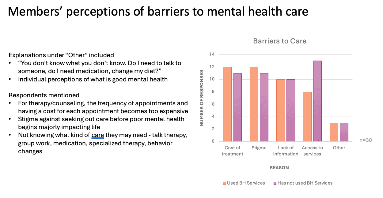
Users noted the 911 emergency number was present despite this no longer being the number for mental health emergencies. However, when a user scrolls down to the 'Get Care Now' section, they are prompted with the appropriate 988 emergency number
48% of users did not find value in listing out the definitions of types behavioral health providers or the redundancy of links to a provider search tool

Documenting Needs
After weeks of discussion, testing, and observing, I now had the task of creating solutions for the users while also trying to ensure the business buy-in. I took into account some of the business concerns regarding costs and prioritization as well as development concerns regarding timeline and strain on the system.
Above all this is the needs of the user and defining an ideal state of this product. I pulled verbatims of our members for the current features in the portal that speak to the needs to identify specific areas of improvement/enhancements.

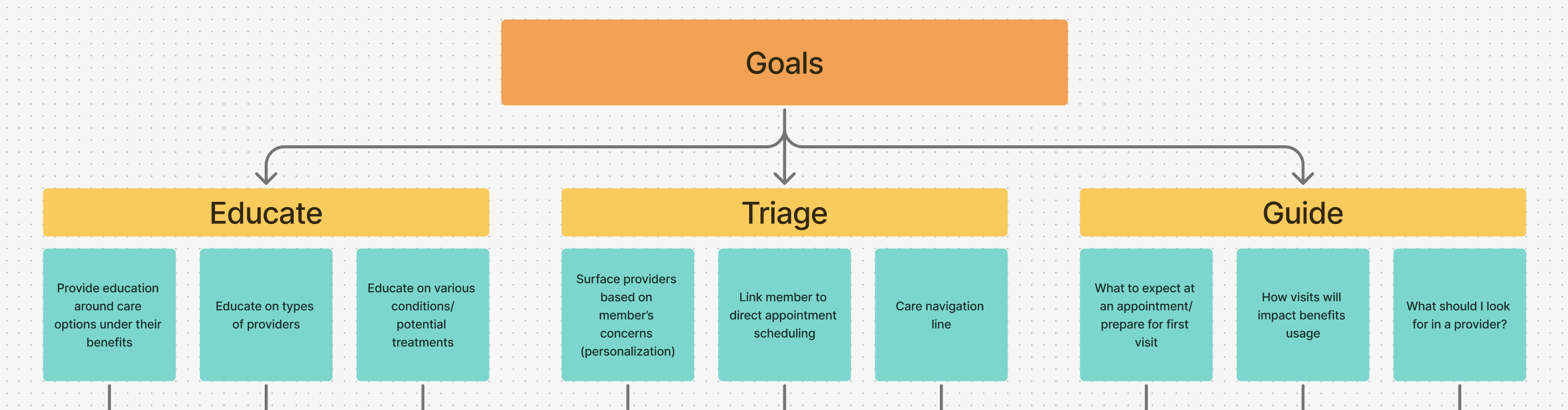
I held an HMW workshop with the Behavioral Health Team to set goals for the project that best fit the needs they hear from members who call into Customer Service. This session revealed both user issues and business issues that we hope to solve in the larger project.
User-centered Problem Statements

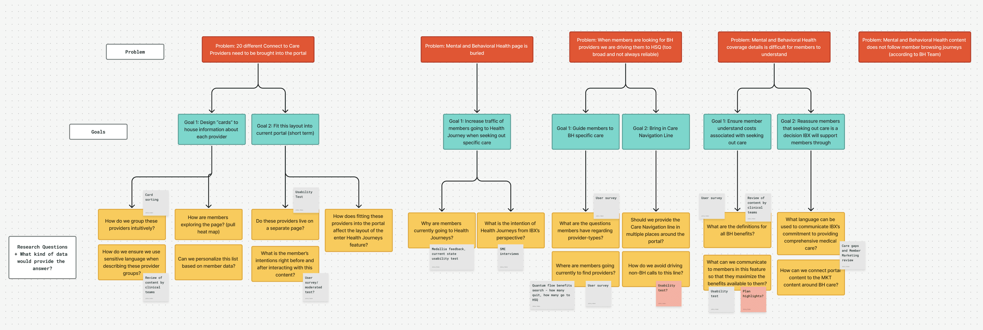
The problems identified span from layout and navigation to the actual content on the page. In order to prevent us from ballooning into a never ending list of issues, I set up a research plan to guide us through each stage of research. I identified some user problems at a high level, defined the goals needed to solve this problem, and added questions that lead up to the research methods to bring the solution to reality.
I received a list of "Connect to Care" (C2C) provider networks from the Behavioral Health Team. The networks are a groups of providers that are contracted to take Independence Blue Cross insurance. This list comprised of 22 different groups who serve a variety of needs, conditions, and age groups. The larger goal of the portal is to provide users with a self-service tool to manage their health insurance and care. This informs the design principles that can be kept as the focus at all stages of research, design, and development.
Bringing in the User's POV
I conducted an open card sort to determine intuitive categories for the C2C provider groups, I provided descriptions of each provider group and tasked users with grouping these descriptions to their preference, I then conducted a closed-card sort to verify that the defined categories do not pose any confusion.
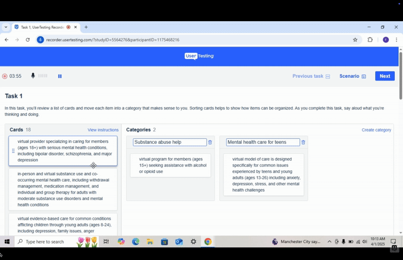
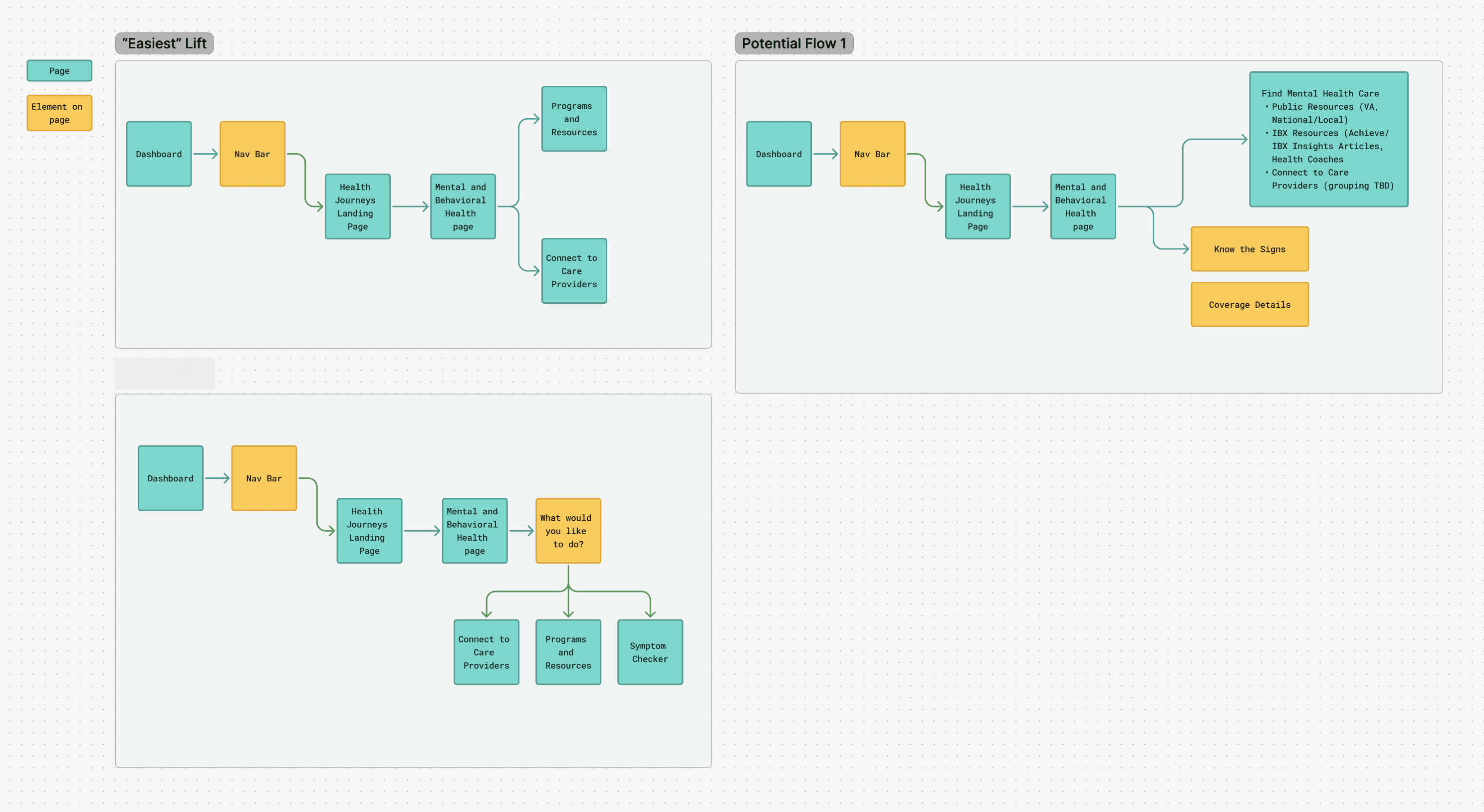
Through this process, I was working closely with the Behavioral Health Clinical Team to ensure I have accurately captured user perspectives and mindsets at the beginning, throughout, and in completing their search for mental health care. With this collaboration, I mapped user flows to present to the clinical team.
Upon mapping the user flows, I began sketching using the Crazy 8s method of ideating. Below are my paper sketches and from here I created lo-fi wireframes to begin testing on layout and flows. I intend to mock up some of the designs in Figma and proceed with testing to assess how this new feature will fit into the existing platform.


